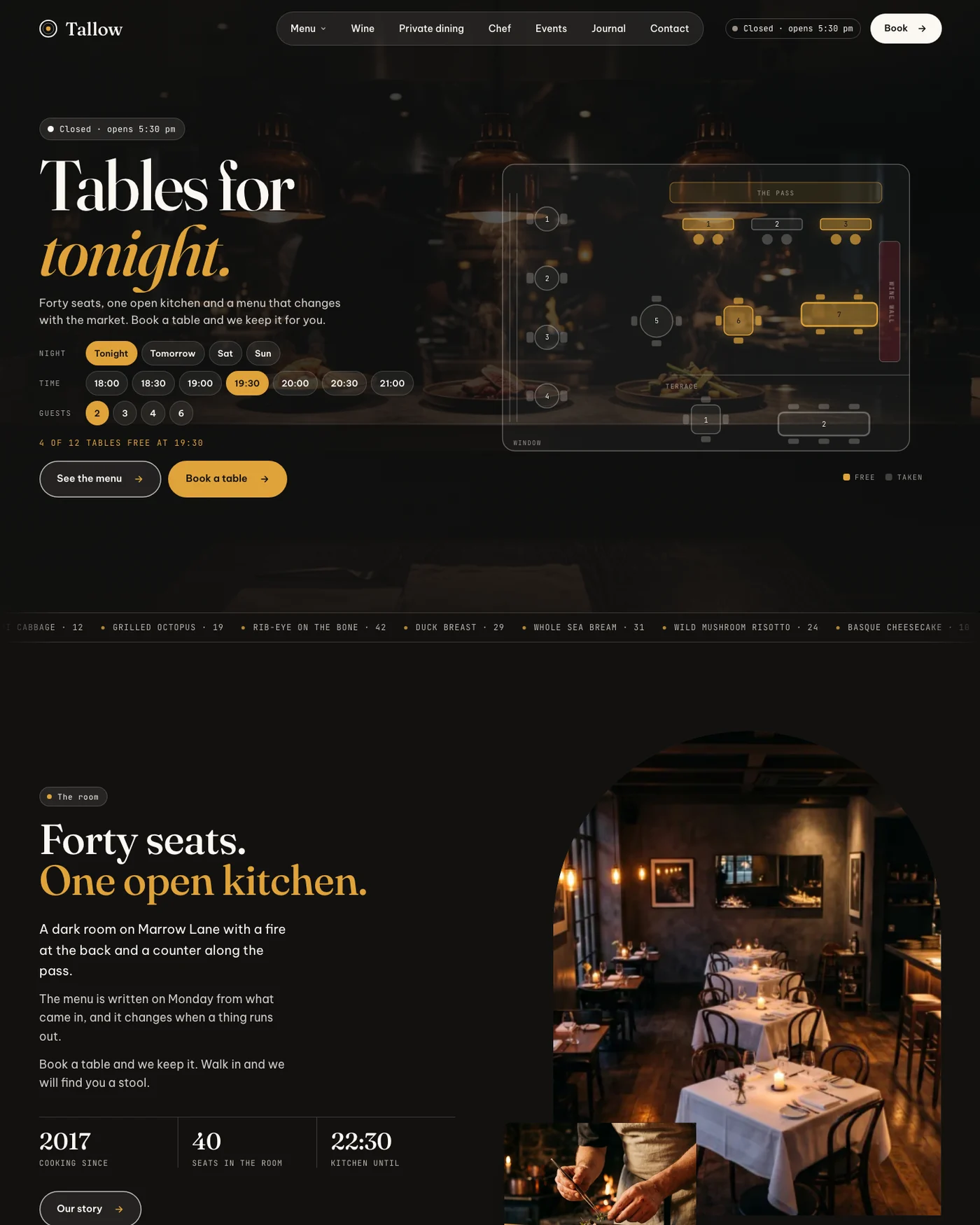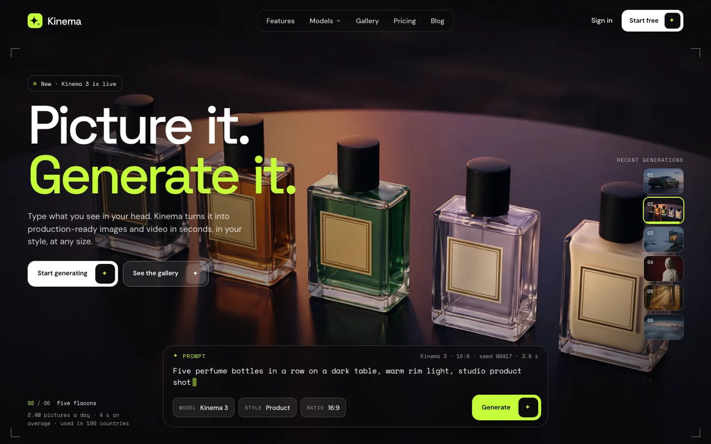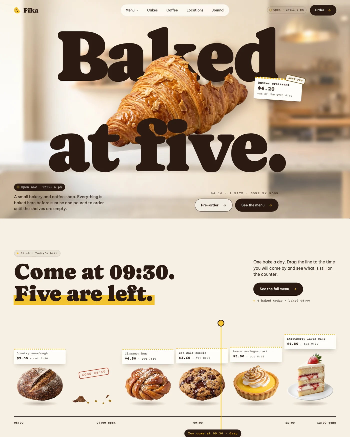
Seven in ten visitors arrive on a phone. Most sites are still drawn at desktop width and squeezed.
Everyone says phone first. Then the review meeting happens on a big monitor and the phone version becomes an afternoon at the end.
Draw it at 390 pixels
At phone width there is room for one idea per screen. That is a gift. It tells you what matters before the desktop layout lets you hide the answer in three columns.
Tap targets are design
A link you cannot hit with a thumb is a broken link. Forty-four pixels is the floor, not a suggestion.
When the phone version is right, the desktop version takes two days.